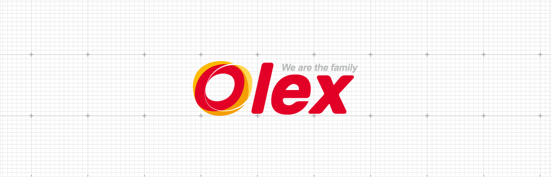
Olex


It is a brand name of DH Chemical Co. and coined from Oil ExpertIntroduction to BI

Introduction to BI
Olex's logo is the most representative visual element symbolizing the company’s another name. The shape and color of the symbol mark should not be altered arbitrarily so as not to damage the image of the company.
Word mark
Olex reflects not only our professionalism as a lubricant brand but also our future-oriented will of the company. Word mark Type Logo is composed of soft circles and curves, thus giving nature oriented feeling of oil as well as a sophisticated and friendly feeling based on humanism. Red Color, selected as the Main Color, contains the image of oil for a young and reliable company. This contains the company's willingness to approach consumers along with the slogan "We are family".
-
Grid
 Grid
Grid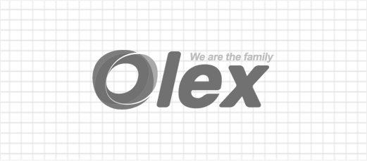
Logo type
Logo type was made by considering the consistent image and legibility of Olex. It is a basic element which transmits the communication function helping word mark at the same time. Therefore standard colors and shapes must be used.
Color
Color is one of the three elements that form the identity of Olex along with word mark and logo type. The expression of color is based on CMYK printing, and the color samples listed in the manual or the color specified below are considered as standard.
